Thursday, 7 October 2010

Preliminary Task

For my preliminary task, I had to create a school magazine, from looking at examples and thinking about target audience and magazine features.


This is the most professional looking magazine cover of the three. The central image is of the school itself, which looks very clean and modern and reflects natural beauty in the clear blue sky and lush green grass at the botttom, which I’m sure would have been created to look like this, it has a very exotic look about it, with the palm trees being in the picture as well. The masthead is at the top of the page in a very fancy font, which makes the school seem of a high standard, the masthead is visible eventhough it is only in white, as it stands out against the blue sky. Underneath the masthead is a strapline, however this isn’t a slogan it is the date of distribution of the magazine, this looks good as it matches the masthead. In the centre of the cover is the school crest, this is nice and big, to make it stand out and is in very bright colours which are very rich and positive looking. There is a banner at the bottom of the magazine which contrasts to the rest of the cover as it is plain white with plain black writing, these are contact details and it is good that they’ve made it so that this doesn’t attract the attention away from the main parts of the cover.


 This is the front cover for a school magazine. It incorporates some of the key features of a magazine front cover: A central image which is made up of two images being combined to portray one, which is clever as it makes it appear that one of the students is actually in the tree. The central image shows two girls at the bottom of the tree, both of which have smiles on their faces, this is a non-verbal code to show happiness and is a clever idea for the front of a school magazine as it reflects a positive image on the school. The green colours, which are splashed all over the cover, are associated with nature and therefore the school is being associated with beauty and peace.
The masthead isn’t very big or in a special font, it is plain and doesn’t relate to the central image, however, it is in black and therefore stands out well against the green background. There are four featured articles, which are of good size, although they need to be in different colours as some of them are difficult to see against the background. There are also stars on this front cover, which are indexical signs as we associate stars with high aspirations and achievements, this reinforces a positive image of the school and they stand out well against the green background.

This is another front cover for a school magazine, this one is a bit more professional looking than the previous one, even though it has been created to look like doodles which would be considered unprofessional looking, the doodles have been created with great care and with attention to detail, this is what makes it appear 'professional' looking. There isn’t a central image as such on this front cover, however the background is of ‘school’ paper which relates to the masthead which is in graffiti style writing and bright colours, which will appear to the student audience. There are flowers coming off of the masthead once again this is reflecting that the school is beautiful and peaceful. There is a strapline just below the masthead which read “Art. Creativity. Life” this reflects well on the school as these are very positive words and the shortness of them makes them very impressive, the strapline is big enough and in a fancy font, relating to the fact that it is an art school. There are featured articles yet again, however this time they are In both bubble and fancy font, once again reflecting the school’s artistic speciality, the yellow and the purple, which runs throughout the whole of the magazine cover, are colour codes for happiness and make the cover more appealing to the teenage audience. There is an ear at the top right hand side of the page just above the masthead, it is in two types of font and very colourful, this makes it eye-catching and draws attention to the year of distribution.


 I have created a front cover for a school magazine. I did this by drawing freehand a template of what I wanted on my magazine cover and where I wanted things to be, including the masthead. I decided to call my school magazine ‘The Rainbow’ as rainbows are often related to happiness and positive things. I have then placed a strapline underneath the masthead reading the “Brightening your day!” slogan. I then decided to incorporate my central image (which is a medium close-up) as being two young girls underneath an umbrella, which relates to the masthead and can be perceived as a shelter / protection, this relates to the school as a school is a form of protection as you should feel safe there. I tried to think of a way to make the central image stand out a lot, as young people concentrate on colours and imagery more than they do text. Therefore I decided that I would make everything above the umbrella, other than a flash, grey and then the colours under the umbrella would stand out more. I have placed a flash just above the masthead and this is in colour as flash’s are used for catching people’s attention and drawing them to a special offer and I thought putting a bright flash on the grey part of the background would make it seem even brighter.
I have used raindrops in my masthead and coloured these blue as blue is associated with water and thus associating blue with rain. I have got on my front cover, a box for inside articles, I have made this into an interesting shape instead of making it a plain square as shapes appeal to young people and I want the magazine to appeal to them.
I have then coloured this in green as green is associated with nature and it is very bright so this will catch attention.
At the bottom of my magazine cover I have placed some puffs (pictures of students having a good time) as young people like to look at pictures before they read anything and this will make them want to read the magazine. Next to the puffs is another raindrop, again in blue (for the same reason as the ones in the masthead), however this one is much larger as it has important information inside.
Overall I think my cover is both eye-catching and appealing to a school aged audience.

When taking this photograph I chose to change the picture from a medium close-up to a full body shot as I thought that incorporating the tree and grass in the shot portrayed a natural and happy environment well, they were also placed in front of one of the school buildings, so that you get the impression that they are school children. I wanted the girls to wear some blue items of clothing so that it resembled the raindrops. The girls are sharing the umbrella, showing a positive attribute for a school child to have and have happy expressions on their faces to portray positivity about the magazine.


I then went on to edit the photograph by using the burn tool to darken the background of the picture, this would make the colours seem even brighter when I de-saturated the background. I then added highlights to the shoes and clothing by using the dodge tool, this attracts attention to the blue in the clothing.


I then carried on with editing the photograph by using the sponge tool to extract the colour from the background surrounding the girls. I didn’t de-saturate the girl’s bodies and an area of grass on which they were stood, this made the girls and the colours of the green grass and blue clothing stand out.


When adding the extra parts to my final magazine cover, I decided to add a blue version of the school emblem with the price in, instead of my original plan of having a yellow flash advertising the pictures inside the magazine. I changed my mind because I thought that making the flash blue would make it tie in better with the other blue features of the magazine and would look more professional being blue than yellow because having so much blue on the cover and then a round patch of yellow I thought would make it look like a juvenile picture of sea and the sun. I made the price 60P as it is aimed at young people and they wouldn’t be able to afford much more than that.
I decided to make the writing a plain font but in rainbow colours, instead of plain with raindrops inside the letters, as I thought that I could portray the font as the rainbow linking with the theme of my magazine cover better. I then added the date of the magazine release in small writing beneath the masthead, this is the ‘strapline’ I made the writing white to stand out against the dark background I also did this to the list of inside articles as well so that, that would also stand out, I then placed this on the right hand side and curved it so it fit the bodies of the girls. I was really happy with the result of my final magazine cover, I think that it would be appealing to young people.


 Here is my contents page for my school magazine. I decided to use a light pastel-yellow colour, as yellow is neutral and can be liked by both girls and boys. I used a clear font for the list of contents, as the magazine is aimed at children, who may possibly find reading difficult and therefore by making the font clear, the copy is easier to read. I decided to make the pages and the information about them different colours and font sizes because young people tend to only read the names of the pages and then read the further information if they are interested in the page. I angled the 'Contents' strapline so that it resembled a rainbow, linking to the front cover so that they look like they belong in the same magazine, I also incorporated a picture of an umbrella in the bottom right-hand corner for the same reason.

The Industry


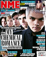
 ‘The Etude’ was the first U.S magazine dedicated to music, it was founded by Theodore Presser in Lynchburg, Virginia. It was first published in October 1883 by 1884 Presser had moved his publishers to Philadelphia where he started the Theodore Presser Company, continuing with the magazine until 1957. In the early 1900’s the ‘Melody Maker’s’ jazz magazine was regarded as the best weekly music magazine for nearly half a century, in 1928 they created the ‘honours list’ it is still regarded as being the UK’s first music chart. By November  14th 1952, ‘New musical Express’ and ‘Record Mirror’ had started to publish the first singles charts in the UK and ‘Record Mirror’ ran the first album charts from 1956. Some music magazines companies have gone on to create TV programmes or air their own music channels, however when Top of the Pops magazine was created it was from the much-loved TV series, ironically the TV series has since ended but the magazine has lived on.
Some magazines such as ‘Melody Maker’, ‘Record Mirror’, ‘Sounds’ and ‘NME’ were labelled as ‘Inkies’ this was started because their ink would rub off on the hands of the readers. When fashion magazines turned away from this format to the glossy covers we see today, ‘NME’ decided to do the same, this proved to be a good move as the rest of the ‘Inkies’ didn’t survive to be seen today.
Music magazines can be categorized in various ways.
The Teen Glossies – such as Smash Hits and Top of the Pops
Critical Monthly Glossies – Q, Mojo and Word
Genre Specific – Kerrang!, Mixmag and The Wire


I researched into who producers and distributes Kerrang! magazine, as this is my main inspiration in creating my music magazine. I soon found that popular magazine producers Bauer - http://www.bauerverlag.de/ produce Kerrang! and have done since 2008

Before this it was produced by EMAP - http://www.emap.com/ and originally owned by United newspapers - http://www.ubm.com/ 
Kerrang!'s publication began on the 7th of June 1981, with AC/DC on it's cover. Kerrang! was aimed at British heavy metal fans in the early years of production. 

Existing Media Texts


Design Process

I created a mood board of all the things that are associated with the genre of music i chose - 'Rock'. I collected band photographs, magazine front covers and logos. By collecting all of these I was then able to look at repeating aspects throughout the mood board and consider these when creating my magazine.
I noticed that a lot of the bands within the genre were male-orientated and if there were any girls in the bands there would mainly just be one, the lead singer. The hair tends to be swaying from one side over to the other and the clothes are mainly dark with a hint of one or two colours. Black and white are two contrasting colours that are seen repeatedly throughout each picture.  

  
 This was my first design for my front cover, I decided to use one person as the central image, with puffs at the bottom of the page of inside articles and a flash on the left hand-side of the central image. I decided to call my magazine 'Kandy' but with a 'K' instead of a 'C' as I think that it makes it seem more suitable for the genre of Rock.


I decided to change some aspects of my magazine cover to see which design I liked the best. In this one I had a group as my central image instead of a singular person. I placed my masthead on a tilt in the left-hand corner as this would be different to how other music magazine genres have their masthead and Rock is all about being different. I decided to colour the puffs to remind myself that I wanted brightly coloured pictures.

After all my research into the genre and analysis of my designs I decided to use the idea of having a single person as my central image but with quite a few puffs of other people (from other bands) down the side, as my genre of magazines use a lot of images. I really like the ‘tilt’ effect of the masthead on one of my designs, however I didn’t want to use it for my masthead as there wouldn’t be room with my puffs down the left-hand side of the cover, so I decided to use the effect for my lead article text. I decided to use the idea of a flash but changed the shape and added a spray and drip effect to some of the corners to make it look more Rock related.

Production Process

I have created these three aspects of my magazine with my research of the rock magazine industry and focusing on my target audience which would be people generally in their teens and people in their twenties. I have created aspects of my magazine which would meet the needs of my target audience, i.e. the colour scheme isn't dull, it is very appealing to the people in my target audience, who generally have very exuberant personalities etc.


Creating My Front Cover
Here is my finished Rock magazine cover, which I created using Adobe InDesign and Adobe Photoshop.


I decided to use a colour palette of a burgundy-red, white and black as the main consistent colours and I think that they went really well together. I incorporated the single person as my central image and I edited the picture to get the results that I wanted. I also edited the puffs of other artists, down the left-hand side, to make them brighter and more colourful, I then placed them each in a box to keep them all neat and the same shape. I also added captions of the band names underneath each, I edited the text to give them drop-shadows. I added two banners to my cover, one at the top and one at the bottom, by adding these I was able to add the popular competition (usually found inside a rock magazine) and a list of featured articles also often found on rock magazine covers. I decided to keep my masthead unedited, I found the font on http://www.dafont.com/ I thought it fit really well with the rock genre as it looks decayed. I added a strapline of ‘Make Life Loud’ underneath my masthead and the price above and to the right.  I decided to place my lead article and anchorage text on a strip of white with torn paper-like edges. I did this by scanning a piece of ripped paper and then on Photoshop CS3 I made it all white so that no lines were visible. I created a barcode on http://www.dafont.com/ and placed this in the bottom right-hand corner. The text inside my flash I added a drop shadow to in Photoshop and the number I gave an inner-shadow, making them seem as if they are coming out of the paper. I made all of the letters on the cover capitals so that the words stood out more.


Editing My Photographs


Here is my central image before and after editing it in Photoshop, it is a medium long shot. I got the model to pose in an effective way and with a happy facial expression. I then edited the background out of the shot, lightened the image, got rid of any imperfections with the spot-healing tool on content aware and I used the dodge tool to highlight parts on the top to make the white stand out. 


This photograph is a two shot and it is a medium close-up. I edited this picture in Photoshop by taking away the background, I then liquified the image to make their skin appear smoother. I increased the brightness and the saturation to make the colours appear brighter, I used the spot-healing tool to diminish any imperfections and I used the sharpen tool to make certain aspects such as the hair sharper. I like the pose I got the models to do as it is not a typical pose for a rock magazine, however I decided to still use it because rock magazines are more relaxed magazines in relation to their photographs in comparison to the glossy magazines.


This photograph is a medium long shot. I edited this photograph by erasing the background, I then used the sharpen tool to sharpen the make-up around the eyes and the the arms of her top. I then duplicated my picture, this enabled me to paint the lips white (mask) and then made the lips red and brought the opacity down so that the lines around the lips weren't harsh. I really like the composition of the model, I made her arms become the leading lines, placing the focus onto her face, the way she's leaning forward also helps to place the focus on her face.


This photograph is a medium shot. I made the model stand with her hands placed on her hips, this makes her stand out as it gives her a larger area of the picture and your eyes get lead from the bright lettering on the top up her arms towards her face. I didn't edit a lot in this photograph, I increased the brightness and erased the background.


Creating Other Aspects

  Here is the lead article for my cover, I found the font on http://www.dafont.com/ I chose it as the font looks like it is eroding, fitting in with the theme of rock. I then edited this is photoshop by duplicating the font and then decreased the opacity of one of them and moved it slightly to the left and down slightly to give my lead article a drop-shadow. I think this looks very effective on top of the ripped paper.


This is the flash that I created to advertise the extra three free posters. I created this in photoshop by making a burgundy-red rectangle using the shape tool, then by using various sizes of the brush tool made the edges less straight, the corners rounded and by using a larger brush size I created a circle in the bottom right-hand corner. I then drew small splashes coming out of the circle so that it made it look like it was splattered paint, then using a thicker brush, I drew longer lines coming down, away from the circle making the 'paint splatter' look as if it was dripping. I then chose a shape from the eraser options and decreased the opacity so that it didn't rub away all of the edge, but made it look more decaying, I did this effect to some parts along the edges of the shape.


Creating My Contents Page
This is my finished contents page for my rock magazine. I created it using Adobe Photoshop CS3 and Adobe InDesign CS3. I continued using the colour palette of burgundy-red, white and black as I did on my front cover, by doing this I created a theme for the magazine, making them appeal to belong together and making it more believable that they would be in a magazine together. I placed the pictures in boxes to keep them neat and I then decided to change the shape of two of the pictures to make them look less organised and more ‘edgy’. I decided to use the separating line between the pictures and the contents list like I had seen on the contents page that I analysed, I think this worked very well, however I changed it slightly by overlapping one picture into the contents page, this also makes the page look less organised as rock magazines, although they have to be organise so they can be read easily, usually try to add small details to keep their magazines alternative to glossy magazines. The font that I used for the sub-headings of each section of pages, I found on http://www.dafont.com/ it is very similar to the bigger ‘Contents’ heading at the top, I think by keeping them similar it makes the page look better. All of the writing is in capital letters making the words stand out and I added the issue number and cover date at the bottom of the page in a banner as this makes the magazine more professional looking as magazines I looked at all had this.


Editing My Photographs


 This photograph is a medium close-up. I edited this picture by cropping it to place the focus more on his face than his arms, I used the spot-healing tool a little to erase a couple of imperfections, such as spots. I then decided to increase the contrast very slightly and decrease the saturation to make it almost black and white. By doing this I find that it makes the picture stand out from the other contrasting, brightly coloured pictures, this is what I wanted as this is relating to the lead article inside of the magazine. I chose a model with piercings and swishing hair as these are aspects that you see on people in rock bands and are a connotation of rebellion, relating to the theme of rock. I made the model wear a red, white and blue checked top (these are very popular among rock band members) and the colours also match my colour palette. I made the model wear a flat-peak hat, as these are a connotation for ‘coolness’.


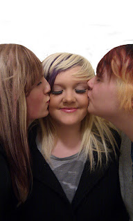
In this medium close-up shot I chose models with brightly coloured hair, this is a connotation of rebellion. I chose for them to wear more relaxed clothing than some of the other band pictures I took, I did this because all rock bands, although they have many similar aspects, are different and I have already portrayed this band as laid-back and happy by the types of pictures I have already taken of them and used on my front cover, so I thought that a more relaxed picture would fit the band’s portrayed personality better. I edited this photograph by increasing the brightness and contrast.


For this medium close-up shot I chose a model both dark and bright coloured hair as this portrays rock band members well. I made the model wear a striped top as striped patterns are commonly seen on members of rock bands, unlike other patterns such as flowers. I didn’t do much to edit this photograph I increased the brightness and contrast a lot, I was going to use the spot-healing tool under the eyes, however by increasing the brightness and contrast, the lines weren’t very noticeable any more so I left the photograph like that.


In this photograph the model is wearing the same as in the photo I took of her for my cover.  I noticed that the attention in that photograph went to the t-shirt, I managed to bring the focus up to her face by using her arms and I decided to do the same in this medium shot. I made the model pose in an ‘eerie’ pose, she looks a little bewitching but that fits into the corruption related to the rock genre. I decreased the saturation of the picture as it makes the colours of her hair, face and clothing less distracting, I then blurred slightly the t-shirt to make it less noticeable.


Creating Other Aspects


I got this font off of http://www.dafont.com/ it is another eroding font, I like using similar fonts as it makes the magazine constant throughout. I then edited the text in Photoshop by duplicating the text, decreasing the opacity on one and moving it very slightly downwards, this gave me a different drop-shadow effect to moving it right or left.


Creating My Double-Page Article

Here’s my finished article, which I made using Adobe InDesign CS3 and Adobe Photoshop CS3. Although it is an article and didn’t need to have as many similarities as the cover and contents page did, I decided to still keep certain aspects slightly similar, by making my background a faded dirty burgundy colour, putting a drop shadow onto my lifted quote and using an eroded font for my heading. I got inspiration for my double-page article from the articles I researched. I decided to place the photographs of my models inside boxes with thick black borders and a black to white fade gradient, I then, inspired by photographs on an article I researched, placed my models slightly outside of the boxes to make it appear as if they were rebelling against being placed inside of a box, I thought this represented the genre well. I placed two small columns of copy, as seen on researched articles, underneath my first picture on the left-hand page.  I then split the remainder of the copy into two tall, slim columns, placing them on either side of the split between the two pages, equal distance from the gap. I made all of the writing on the pages white as it was the easiest colour to read from against the darker background. I used a lifted quote on the right-hand page opposite my heading, I did this as it give you a small insight into the article, I kept this in mind whilst I was choosing which part would be best for me to lift form the text for the quotation. My copy on the article was carefully planned, I looked into many types of writing in different rock magazines I then took the types of subjects the bands talked about and using my own creative flair, produced an article about subjects a rock band might talk about and issues that could arise in a rock band, by doing this it made my article believeable.


Creating Other Aspects


This is the background created for my article I altered the brightness on Photoshop to make it a little brighter, I then made the colour a dirty, burgundy shade, this was done to make it relate more to the contents page and cover of the magazine. I really like the scratched, worn-away look of the background and I chose it as it was similar to one I noticed when researching into rock magazine articles.


Editing My Photographs

 
This long shot is of a model with both bright and dark coloured hair, I brightened this by using the sponge tool on the saturate setting and brushing it carefully on the red areas of the hair. I erased the background so that when I place it onto my article it would be just the figure and no background.  Made the model stand with hands on hips, I did this as it looks more ‘edgy’ and less innocent than standing with her arms down. I dressed her in dark slashed clothing as this is a connotation of rebellion and is commonly seen on rock fans/band members. I made the model thinner by pinching in the waist, lifting the underarms and thinning the arms and legs with the pucker tool in the liquefy filter. I used the spot-healing tool to diminish any blemishes and the bruise on the model’s right arm. I duplicated the image and applied the hard light blending option.


This medium shot is of a model with a flat-peak hat on, which is a connotation of ‘coolness’ and wearing a band t-shirt which is showing death and destruction this is related to the genre of rock. I made the model stand in direct mode of address, however I made him face slightly away from the camera this was inspired by a picture I saw when researching rock magazine articles. I got the model to pull at the neck of his top to contrast with the way his head is facing. I edited this picture by erasing the background, I used the spot-healing tool on content aware, to replace the missing parts of his skin and top, where the date and time details overlapped the model’s arm and also used it to replace areas where imperfections were visible. I duplicated the photograph and applied a black and white filter to the extra picture, I then set the blend mode to hard light.


This medium shot is of a model in plain clothing pointing upwards, I chose for the model to stand like this as his arms pointing upwards will direct the reader’s eyes back up to the main part of the article, which is why I placed it in the bottom right-hand corner of the article. I edited this photograph by erasing the background, I found an image of a band logo and placed it onto the photo, I cropped this to make it able to fit the t-shirt worn by the model, I then warped the logo to make it appear that it is actually on the t-shirt and I then set the blend mode to multiply. I did this to make the clothing worn by the model more rock-related. Using the lasso tool I chose the area of the model that was clothing and copied the clothing to a new layer, I changed the blend mode to hard light and then increased the contrast. I then used the burn tool on midtones to darken his eyes and increased the contrast on his hands, face and neck, I selected these with the lasso tool. I used the pucker tool on the liquefy filter to make his t-shirt more crinkled at the bottom.


Creating Other Aspects
This is the lifted quote that I chose to place on the top of the left-hand page opposite the heading. I chose a simple font as this would contrast against the eroded font of the heading. I made the font white so that it stood out against the dark background and then added a drop-shadow to it in Photoshop by duplicating the text, making one a grey colour, decreasing the opacity of it and moving it slightly to the left.


I got the font for my heading off of http://www.dafont.com/ I chose again, the eroded style font , this works well as the rest of the copy on the page is in a simple font. I added a drop shadow to this as well by duplicating it and making one layer a grey colour, decreased the opacity and moved it slightly to the left.